Reaction buttons
These are why you're here in the first place, right?
From your dashboard, you can customize the functionality and appearance of your reaction buttons.
We'll walk through each option, starting with the functionality settings at the top and working through the appearance settings on the bottom.
Note: Each content section is given it's own set of reaction buttons to customize and a corresponding API key!
Functionality
Right there in a drop-down menu at the top is the language setting for this particular set. We have default support for five languages, but the text of the buttons and prompts can be customized into any language.
Button box

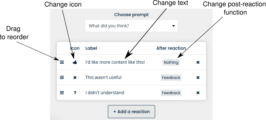
Next comes the button functions. Each row in this box represents one button and its related functions. To skip the setup and get a ready-to-go set, click "Select a ready-made button set" and choose one of the two tried-and-true sets we've put together.
Each button can be edited individually, with options for order, icon, text, and after-reaction functionality.
Dragging the stacked bars on the left will change the order of the buttons. You can also drag and drop the buttons that display in the preview at the bottom of the window. If you have the "Include icons" setting on, you can select an icon from the React & Share default set, or upload your own PNG or SVG file.
Clicking on the text displayed in the label column will allow you to edit it. There is no length limit to this text, and our buttons will resize to match (but the actual buttons will only be as wide as the container you place them in on your site)
After reaction
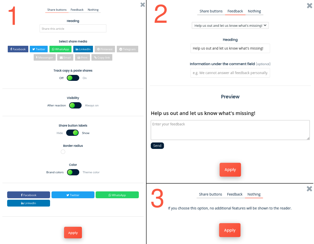
Here's where you can set what will happen after a reader clicks a reaction. Clicking the grey button in this column will open the following menus:

Each button can either do display social media share buttons (1), open a feedback form (2), or do nothing (3). To select one, click the correct tab at the top of the menu and then click "Apply".
You can edit the options that are displayed, then click "Apply" at the bottom to save the reaction button action and customization.
Note: The settings are applied across all the buttons in the set. For example, if you change the header text for the share buttons in one button's menu, the settings will apply to all buttons set to display the share button menu after it is clicked.
Appearance
All the settings under the button box customizes the appearance of the buttons.